Process / 3 minute read
Designing the artwork and shirt color as one composition
A shirt is not a blank white page. Its color surrounds every printed mark, changes perceived contrast, and follows the body. We design the garment and graphic together because separating them leaves half the composition unresolved.
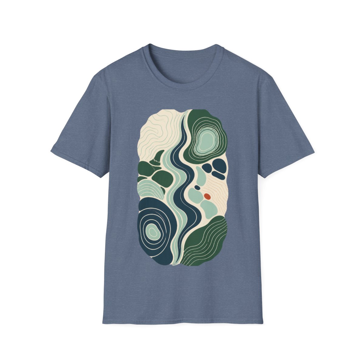
The ground changes everything
The same blue behaves differently on Natural, Dark Heather, and Heather Indigo. On one it becomes the loudest element; on another it recedes into a family of neighboring tones.
Choosing the ground early lets negative space carry real visual weight. Areas without ink stop feeling empty and become deliberate shapes inside the work.
Wearability is part of the brief
The best color system is not simply the one that looks strongest on a screen. It has to work in daylight, under indoor light, at conversational distance, and alongside the clothes people already own.
One edition, one answer
Offering every design on every garment color can look like choice, but it often weakens the original idea. Each SHRTWRKS edition pairs one composition with the shirt color that completes it.