Design notes / 4 minute read
What makes a graphic tee feel grown-up?
The graphic tee never needed to be retired. It needed better editing. The difference between a shirt that feels considered and one that feels juvenile is rarely age; it is the quality of the visual decisions.
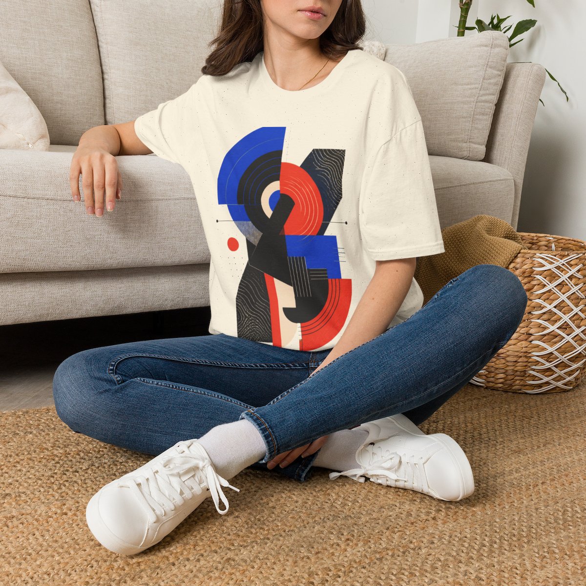
Start with composition, not a message
Many graphic tees are built around a phrase, with the image acting as decoration. A design-led shirt reverses that hierarchy. Shape, rhythm, contrast, and negative space do the talking.
That makes the shirt easier to wear with the rest of an adult wardrobe. It can sit under a jacket or beside a good pair of trousers without turning the wearer into a billboard.
Treat color as material
The garment is the largest field of color in the composition. Ignoring it is like designing a poster without knowing the paper. A strong graphic tee uses the shirt color to complete the image, not merely hold it.
Restrained palettes also help. Restraint does not mean neutral; it means every color has a job and the loudest note has something quieter to push against.
Let detail reward a second look
A successful shirt should read from across a room and become more interesting up close. Large structure creates the first impression. Smaller marks, textures, and relationships give the design staying power.